
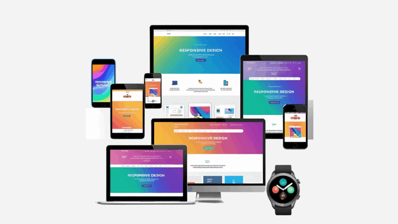
In an era where users jump from smartphones to tablets to desktops and even smart TVs, your website must be ready to perform flawlessly on any device. As we enter 2025, responsive design is no longer just a “nice-to-have”—it’s a non-negotiable if you want to succeed online.
Here’s why responsive design is critical for your business, brand, or digital presence in 2025.
1. Mobile Traffic Dominates the Web
Over 60% of global web traffic now comes from mobile devices—and that number is only growing. If your website doesn’t adapt to smaller screens, you risk losing more than half your visitors instantly.
Why it matters: A responsive design ensures your content is accessible, legible, and visually appealing on every screen size—boosting retention and engagement.
2. Google Prioritizes Mobile-First Indexing
As of 2024, Google uses mobile-first indexing for all websites. That means Google primarily crawls and ranks your site based on its mobile version. If your site isn’t mobile-optimized, your SEO rankings will suffer—no matter how great your desktop site looks.
Learn here on how to make your website ready for mobile-first crawling and indexing.
3. Better User Experience = Higher Conversions
A responsive website adjusts layout, font size, navigation, and images depending on the device. This eliminates pinching, zooming, and frustrating scrolls.
Outcome: Smoother experiences lead to lower bounce rates, longer session times, and higher conversion rates—especially for e-commerce and lead generation.
4. Future-Proofing for New Devices
2025 is bringing more than just phones and laptops—think foldables, wearables, AR glasses, and large-format touchscreens. Responsive design prepares your website to adapt to these emerging formats seamlessly.
You won’t have to redesign your site every time a new device hits the market. Learn how app development and responsive design go hand in hand in creating next-gen digital experiences.
5. Cost-Effective & Easier to Maintain
Maintaining separate websites for mobile and desktop is outdated and expensive. A single responsive design simplifies updates, improves consistency, and reduces long-term maintenance costs.
Pro tip: Use frameworks like Bootstrap or Tailwind CSS to streamline responsive design from the start.
6. Accessibility and Inclusivity
A responsive website is often more accessible for users with disabilities who may rely on different screen sizes and assistive technologies.
Inclusive design expands your reach and supports your commitment to digital accessibility.
Final Thoughts
In 2025, users demand fast, beautiful, and consistent experiences across all devices. Responsive design is the foundation of any modern web strategy. It improves user experience, boosts SEO, future-proofs your site, and saves you time and money. If your site isn’t responsive yet—this is your sign to make the switch.


